Page 1 of 1
Better Mousetrap: cover

Posted:
Thu May 04, 2006 10:23 amby Steven Trustrum
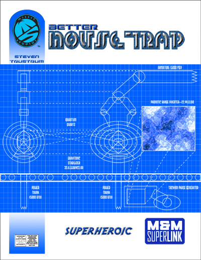
Here is a peak at the cover
Posted:
Mon May 15, 2006 9:50 pmby DSumner
Steve, and don't take this the wrong way, while it looks nice, IMHO, its got way to much blue in the cover. It just doesn't stand out like your previous work. Is their anyway you could do up a recolored version?
Posted:
Wed May 17, 2006 12:00 amby Steven Trustrum
It's meant to be that way. The blue on white is a thematic choice that speaks to the blueprint aspect of "building a better mousetrap."
Posted:
Wed May 17, 2006 10:52 amby Anonymous
I know I am new here but I have to agree with my bud DSumner. Perhaps a very minor alteration like:
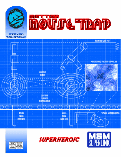
It just seems to Pop.
Posted:
Wed May 17, 2006 1:03 pmby Steven Trustrum
Hmmm, seeing the titles done differently allows the rest of the theme to stand. Let me experiment with the titles a bit and see if anything strikes me.
Posted:
Wed May 17, 2006 1:36 pmby Anonymous
If anything it accentuates both the Title and the subject.
Posted:
Tue Jan 16, 2007 2:12 pmby Steven Trustrum
This product is back up and running after I was off for half of last year with illness. More good news: Eric Lofgren (
http://www.ericlofgren.net/) has signed on to do the artwork.